Behind Altar & Archive: Why Wedding Websites Deserve Better
We built this because the wedding site is not admin — it's the first impression. Here's why that matters and what we're changing.
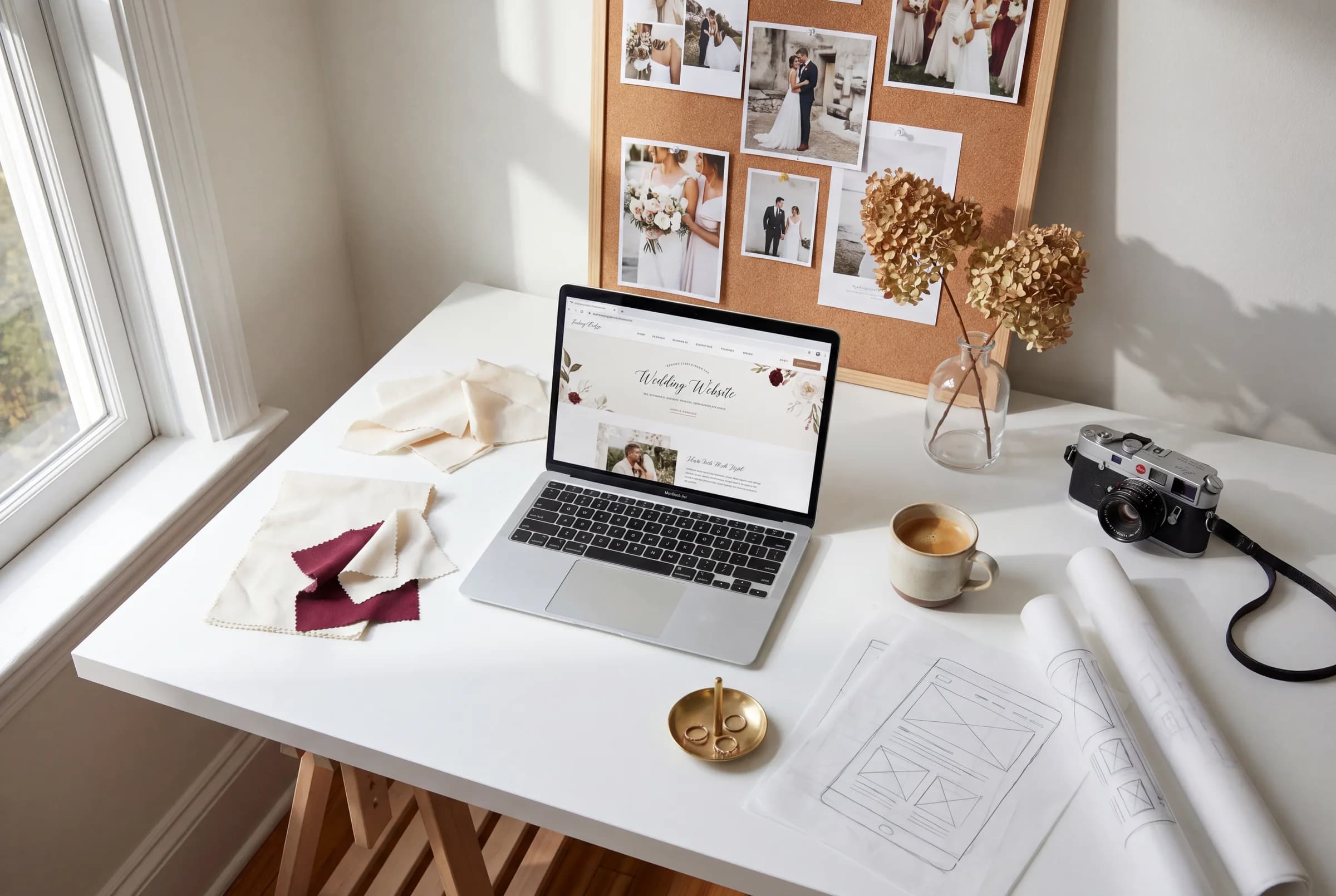
The wedding starts before the wedding
Altar & Archive started with a belief that wouldn't leave me alone: the guest experience starts the moment someone opens the link. Not when they arrive at the venue. Not when the music starts. When they're sitting on their couch, half-scrolling, opening the wedding website you texted them.
That moment matters. And most wedding websites treat it like admin.
The problem with wedding websites
They're either beautiful but impossible to use, or functional but visually painful. The pretty ones make you hunt for the address. The functional ones look like they were built in 2012. Nobody has figured out how to make a wedding site that looks considered AND actually works — and that gap drives me crazy.
What we're building
A platform where design and planning live together. Where the template you pick doesn't just look good empty — it looks good filled with your real, messy, specific details. Where the RSVP flow doesn't make your aunt call you for help. Where the site feels like the first page of the weekend, not a spreadsheet in disguise.
What we're protecting
Less friction. Fewer scattered notes. Better guest communication. A site that feels as styled as the dress, the flowers, the tablescape — because it should. The wedding website is the first thing your guests see. We think it deserves the same care as everything else you chose.
That's the whole point.
Words by Mercedes
Editorial planning notes from Altar & Archive, written for couples who want the practical details to feel as considered as the design.